From Eric Cantona’s turned-up black collar to two numbers that graced the torso of David Ginola, we rate the finest fashions the Premier League has seen.
20. Derby, 1997-98 (home)
For some reason, shirts became incredibly baggy in the late ’90s – picture Steve McManaman hurtling along in a long-sleeve that looks like he borrowed it from a much bigger brother.
However the Rams’ natty Puma-made white effort was one of the few that looked bang on, particularly when modelled by confusing human-octopus hybrid Paolo Wanchope: a mass of limbs, skill and confusion wrapped in a shirt the size of a beach windbreak.

19. Everton, 2015-16 (home)
A little turret and a couple of elephants can only enhance a football shirt, and while all Umbro’s efforts have been admirable, last season’s version was possibly the best, making Leighton Baines look every inch the mod idol.

18. Nottingham Forest, 1992-93 (home)
Some will lobby that the bold 1994 effort you might picture Stan Collymore or Jason Lee striding about in was better. But this effort tops it for our money, thanks to its subtle pinstripes, understated logo, and the sponsorship of Shipstones, a decent, gritty local brewer that chimes better with Roy Keane’s ultraviolence than Canadian swill-merchants Labatts, who took over the following term.

17. Sheffield Wednesday, 1992-93 (home)
The Premier League still doesn’t seem quite right without former top-flight stalwarts Wednesday in it. Their ’92 season strip was a knockout: another Umbro effort, worn with aplomb on the wing by The Waddler.

16. Manchester City, 1994-95 (away)
City may have been a shambles on the pitch, but their Umbro tops were always super sharp. The understated Cambridge blue and the pinstriped white away versions particularly stood out, and were iconically donned on Cool Britannia lads mag covers by Liam and Noel Gallagher – making the ‘Brother’ sponsor seem even more apt.

15. Wimbledon, 1994-95 (home)
Wimbledon never did anything by the book, and brilliantly didn’t even bother having a kit supplier in this season – instead getting ‘The Crazy Gang’ embroidered over the heart. An unusual combo of dark blue and yellow trim, it’s the only kit you’d want an opponent to be wearing as they lightly twisted your testicles or spat foul insults about you being an orphan down your earhole.

14. West Brom, 2016-17 (home)
Baggies kits looked amazing in the 1960s and ’70s, before running a gamut of awfulness through much of the next three decades. But last term’s effort was genuinely stunning: with UK-K8.com’s Chinese lettering (凯发娱乐) combining perfectly with the traditional old stripes, it looked like it was beamed down from space (in a good way).

13. Coventry, 1996-97 (home)
Coventry’s pantheon of kits over the years have arguably been the most vile of any club anywhere on earth, but this Le Coq Sportif dazzler was the exception to the rule – a Sky Blue-Dark Blue combo worn beautifully by the likes of Peter Ndlovu.

12. Portsmouth, 2003-05 (home)
Happier times for Fratton Park’s loyal fans, and their greatest kit, only enhanced by having a nice little heart on the front courtesy of Beanie Baby manufacturers Ty – which also led to a range of Pompey bears.

11. Tottenham, 1997-99 (home)
David Ginola can’t be seen in any old tat – and the French matinee idol looked impeccable in this glorious Tottenham top with its minimalist design and retro collar. The German duo of adidas and Holsten was also apt for the era of Jurgen Klinsmann. Euro chic.

10. Southampton, 2001-2003, home
Like Newcastle, it’s hard to design a bad Saints shirt – and we’re devotees of the five medium-sized red stripe model that was adhered to between 1896 and the mid-1970s. The millennium-straddling model was near-perfect – fit for Le Tiss to blast some of the Premier League’s best ever goals in.

9. Liverpool, 2013-14 (home)
Liverpool had some of the best kits in the ’60s, ’70s and ’80s – simple, bold and striking – before hitting the skids through much of the Premier League era, both on the pitch and in the designer’s studio. But they’ve been getting it together in both departments over recent years, and the 2013-14 model, worn by Luis Suarez as he did his damnedest to drag the Reds to the title, was the best effort: a hat tip to the side’s much-told history without dipping into nostalgia.

8. West Ham, 1999-01 (home)
The best claret ’n’ blue shirt ever made: a rare Fila venture into the field of making UK kits, this none-more-London combo of classic colours and Dr Martens sponsor logo looked a treat on the back of genius-slash-madman Paolo Di Canio.

7. Leeds, 1995-96 (home)
Thanks to the kind of extreme decluttering that would delight Channel 4’s Obsessive Compulsive Cleaners, Leeds looked a billion dollars in ’95. Asics simplified the lot – no mad swirls, sleeve trims or fancy collars here; they even took off the shield-shaped United crest and replaced it with a lovingly embroidered L.U.F.C. Suddenly, Tony Yeboah, Gary Mac, Brian Deane & Co. resembled something out of the Don Revie era. Glorious.

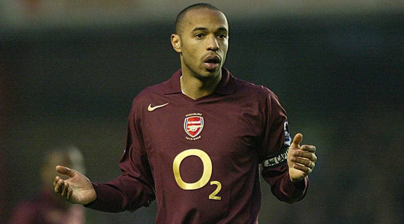
6. Arsenal, 2005-06 (home)
An opinion-divider (some felt Arsenal should always wear a proper red), the ‘currant’ kit was brought in for sentimental reasons: the Gunners were leaving Highbury and decided to replicate the colour they’d worn in 1913, the year they moved in. Wrong or not, its enticing Beaujolais hue looked magnifique on Thierry and company.

5. Manchester United, 1994-95 (home)
The successor to United’s odd lace-up white-collar effort – a shirt they won their first two Premier Leagues in, but could make Steve Bruce look like he was prancing round in a medieval ruff. The black V-neck was much cooler: it was the definitive garment for Cantona’s iconic collar-popping – and Umbro’s designers also somehow embedded a picture of Old Trafford into the shirt, too. Cosmic.

4. Blackburn Rovers, 1994-95 (home)
It’s hard to get a Blackburn kit wrong: simple blue and white halves always look terrific, and the year they won the Premier League title also coincided with one of their most beautiful shirts, a natty effort that somehow even a McEwan’s logo couldn’t spoil.

3. Chelsea, 2001-03 (home)
Chelsea’s suppliers have never had trouble making great-looking kits: white on royal blue is always cracking, and even the current adidas kit is pretty special. But this one was deeply simple in the best possible way, with a clean design and the marvellous old Chelsea lion badge – which all big cat enthusiasts agree should never have been changed.

2. West Brom, 2015 (1968 replica)
People view the ’60s through rose-tinted spectacles: yes, they had The Beatles and 1966 English glory and a man going to the moon – but people generally only took a bath once a week and there was no wifi. Nevertheless, football shirts were unquestionably better back then, largely because they weren’t plastered with the logos of dignity-stripping official noodle partners or betting conglomerates.
Thus, the one-off 2015 recreation of West Brom’s ’68 FA Cup Final shirt, produced for their ‘Jeff Astle Day’ fixture with Leicester, was clearly the finest shirt ever worn during a Premier League game.

1. Newcastle, 1995-97 (home)
Probably the greatest shirt of the Premier League era, and certainly the most Geordie item of clothing ever: with a Newkie Brown label plastered over the top of the magpie stripes, it’s an adidas masterpiece that can perhaps provide a little solace for fans who still rue the fact they didn’t win the league while wearing it.


